Cloud visibility, visualization, and architectural diagrams – talking about cloud essentials
Providing total visibility into your infrastructure is critical at the start of your cloud transformation journey. It doesn’t take much effort to open a cloud account and spin up instances. But cloud professionals don’t always have the time to lay the groundwork for keeping costs under control. Things get even more complicated when you consider that cloud environments often involve multiple departments and individuals. A lack of understanding of what’s happening inside infrastructure causes governance and accountability problems and spurs the cost of cloud growth.
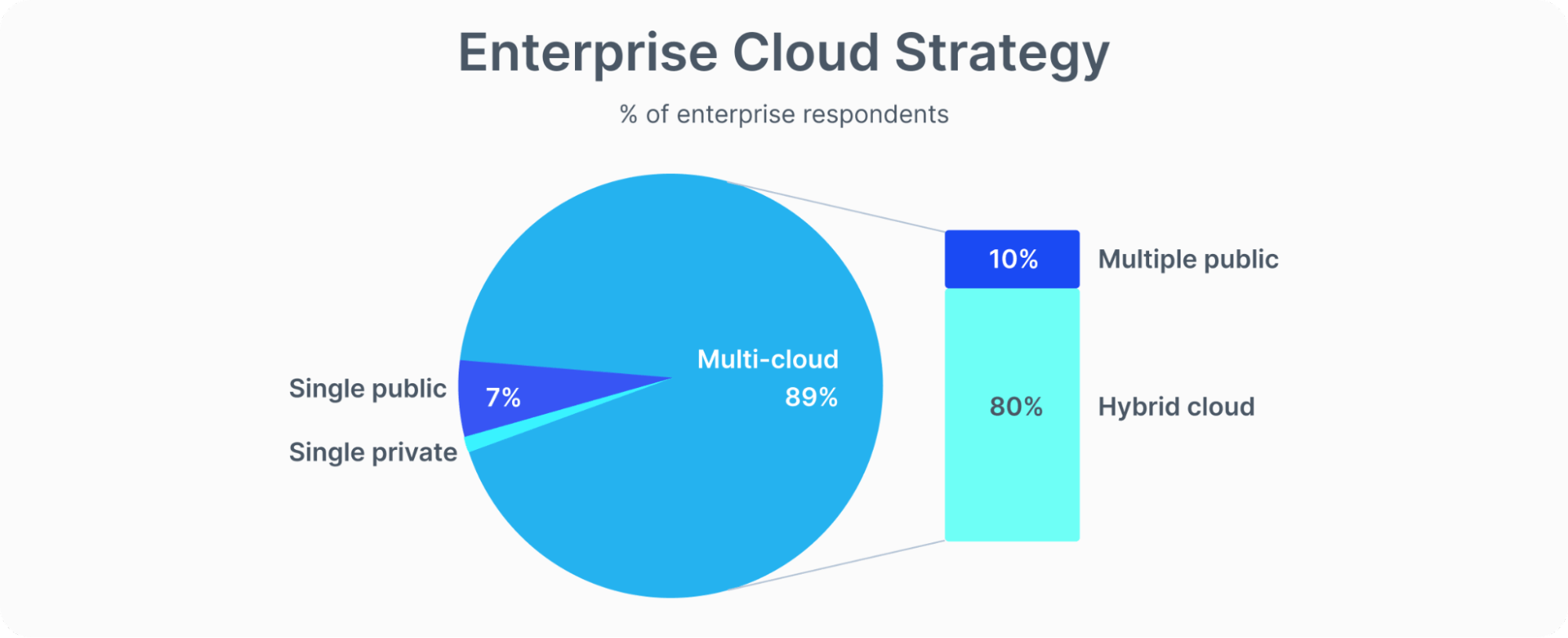
According to Gartner, by 2026, public cloud spending will exceed 45% of all enterprise IT spending. And while the cloud migration trend has been steadily increasing in popularity, organizations may impact their own growth if they accumulate cloud waste. And the risk of that happening is very high. For example, Flexera’s responders self-estimated that their organizations waste 32 percent of cloud spending, up from 30% in 2021. In addition, a multi-cloud approach is steadily growing in popularity among IT organizations, as indicated by the fact that 89% of Flexera respondents have a multi-cloud strategy. Given these numbers, imagine how tricky it would be to control the cloud processes in a complex hybrid/multi-cloud IT architecture. So let’s have a conversation today and discuss what can be done to keep your cloud-based environment under your watchful eye, irrespective of the cloud consumption strategy.
Cloud visibility and cloud visualization – not a single step without them
Even world-class giants like Netflix have faced a cloud visualization challenge through the tough experience of a system outage on Christmas Eve, resulting in Netflix downtime. For those Netflix customers depending on the streaming service for good Christmas entertainment – well, one year it didn’t happen. Together with other lessons, Netflix learned after the 2012 outage, that they would need to bring sophisticated visibility and visualization to the cloud environment. Understandably, this became their ultimate target.
“Good visualization helps to communicate and deliver insights effectively. The front-end interface must provide dynamic data visualizations that can communicate cloud insights in a very effective manner. Operational visibility with real-time insight enables us to deeply understand our operational systems and find and fix problems quickly to continue to innovate rapidly and delight our customers at every interaction,” says Justin Becker, Director of Engineering at Netflix.
Honestly, it isn’t an easy task to monitor complex cloud environments that multiply by leaps and bounds between various accounts. However, the solution to the problem is obvious - you’ve got to open your eyes and see everything happening inside your cloud. But, of course, it’s easier said than done.
First, let’s understand the concepts of visibility and visualization:
- Visibility is about seeing what is happening at any point in time. It provides an understanding of where the instance/service is at any point in its lifecycle while giving a little context on what happened before or what might happen next.
- Visualization, on the other hand, allows cloud infrastructure owners to form a mental image of the architecture, creating a far more sophisticated picture. It aggregates all visibility points across the system and presents them in detailed architectural diagrams and textured graphical presentations. Cloud visualization exposes a comprehensive view of the infrastructure, guaranteeing cloud cost optimization steps are taken.
Cloud visibility and visualization from cloud providers
AWS, Google Cloud, and Microsoft Azure have ensured that their customers keep track of changes and costs in cloud infrastructure and offer the following solutions:
- Amazon QuickSight makes it easy to develop and host unified dashboards and get instant responses to local language queries.
- Amazon CloudWatch supports custom metrics and a possibility to graph/control billing-related information.
- Azure Data Explorer Explorer is a highly scalable data mining service used to build complex data processing solutions. Azure Data Explorer is highly integrated and can also integrate with visualization tools.
- Azure Monitor enables monitoring of Azure services and first-party solutions, providing detailed cloud infrastructure monitoring for deep insight.
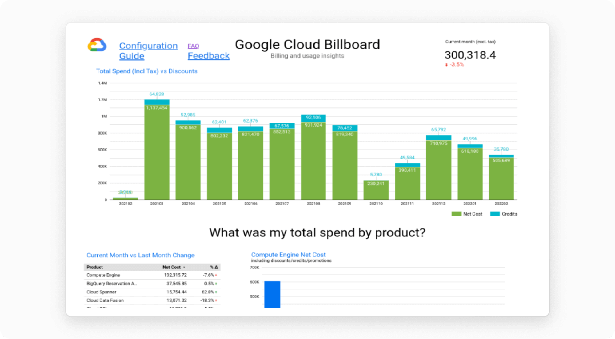
- Data Studio from Google Cloud can help make sense of data and aid in interactive analysis. In addition, data Studio helps keep field trends under the radar, react quickly, and leverage data forecasting.
- Google Operations (formerly Stackdriver) provides metrics, logs, trace support, and visibility into Google Cloud platform audit logs.
Source:cloud.google.com
Architectural diagrams. Draw or have them drawn?
The primary purpose of Cloud Architecture Diagrams is to document the Cloud Computing Architecture to improve communication among stakeholders. Well, that’s true in part... But it is also a much easier way for engineers and managers to depict cloud components so they can see the big picture and detect red-flag cases.
When it comes to communication solutions, good old slide presentations still emerge. But slides are nearly useless in mapping many logical structures that make up cloud infrastructures, including system chorographies, security zones, CI/CD pipelines, and service dependencies.
Such detailed mapping should not be considered as optional and it clearly goes well beyond ‘nice to have just in case’. Providing a broader context for understanding the dependencies between complex systems is, quite simply, mandatory. Diagrams that spare no detail can answer general questions about compatibility, interoperability, and other issues. On the other hand, in cases where each detail matters (and they matter here since cloud-based infrastructures absorb at least one-third of business budgets), you need a much larger canvas on which to express and reveal the end-to-end picture of the cloud interior.
Once it becomes obvious that detailed architecture diagrams are essential, you now face the question: who will create them? DevOps experts, of course. How will they do this? I won’t list all the architecture diagram tools on the market, but will focus on one as an example – the Google Cloud architecture diagramming tool, which allows you to:
- Build architecture diagrams, while providing a list of all the Google Cloud products and services in one spot
- Get inspired by prebuilt 10+ reference architecture
- Enjoy one-click deployment of your architecture diagrams once you are happy with the one you’ve created.
Great tool, but what if your infrastructures are not on Google Cloud? What if you are a fan of the multi-cloud approach? What if you already have an infrastructure and need to see what’s going on there? Most importantly – when do DevOps engineers find the time to draw cloud infrastructures? They will have to make changes to these diagrams after every architecture update. This process is quite time-consuming, like it or not, even with helpful solutions available. The time DevOps experts waste on creating architectural diagrams, I’m sure, can be spent on creating more valuable content for the business.
Uniskai – excellent cloud visibility, cloud visualization, and auto architectural diagrams
Although cloud technology providers deliver cloud visualization and cloud architecture diagramming tools to their users, most of them have several significant disadvantages:
- No real-time statistics. Most reports are updated every 24 hours or less often, causing noticeable starvation for understanding the real-time picture. Uniskai by Profisea Labs is updated systematically, and you can push the update button whenever you want.
- Too complicated for non-specialists. In most cases, organizations need cloud experts to customize, automate visualization dashboards, and translate data from expert language. Cloud-non-experts can use Uniskai’s user-friendly UI for independent cloud infrastructure interpretation and management.
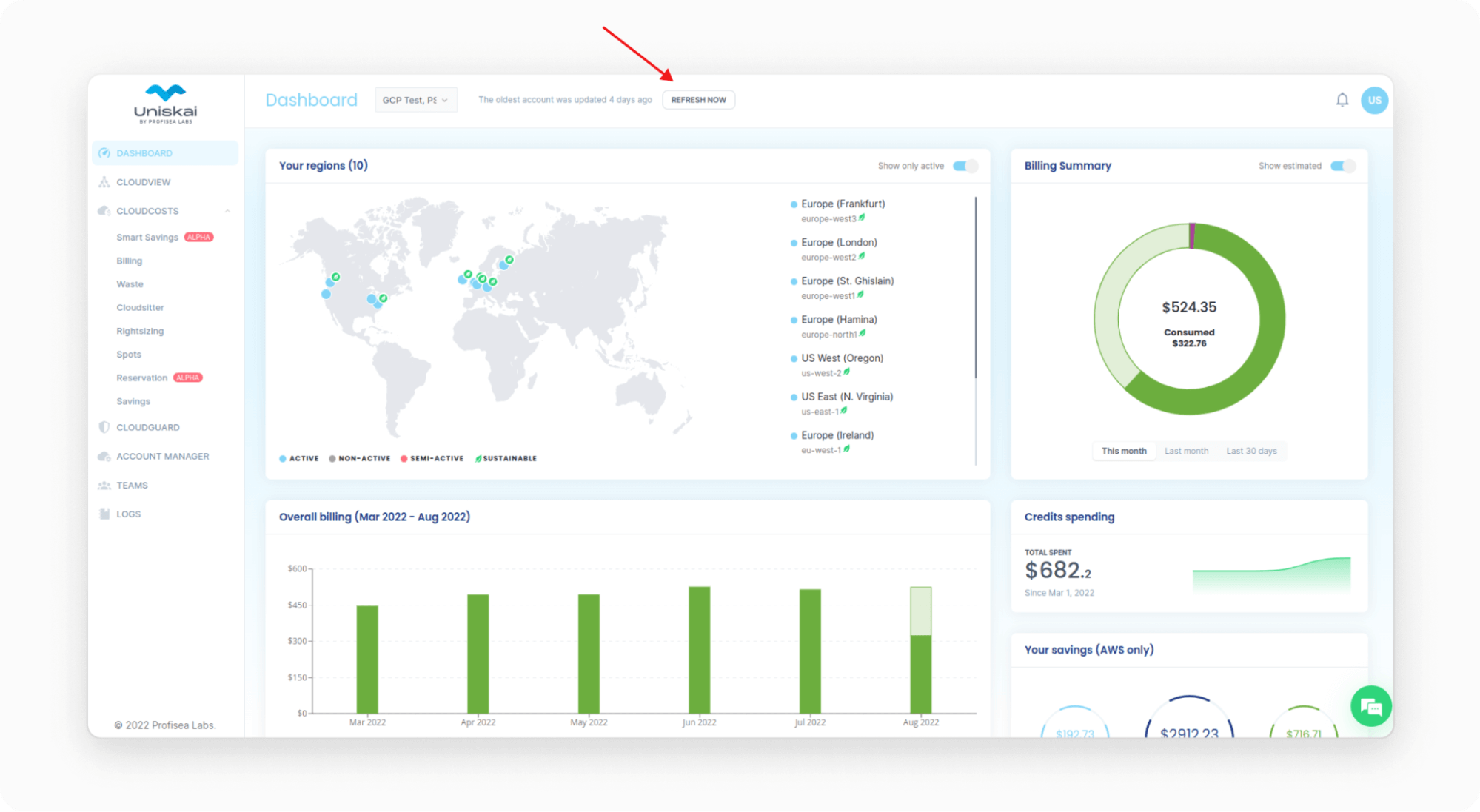
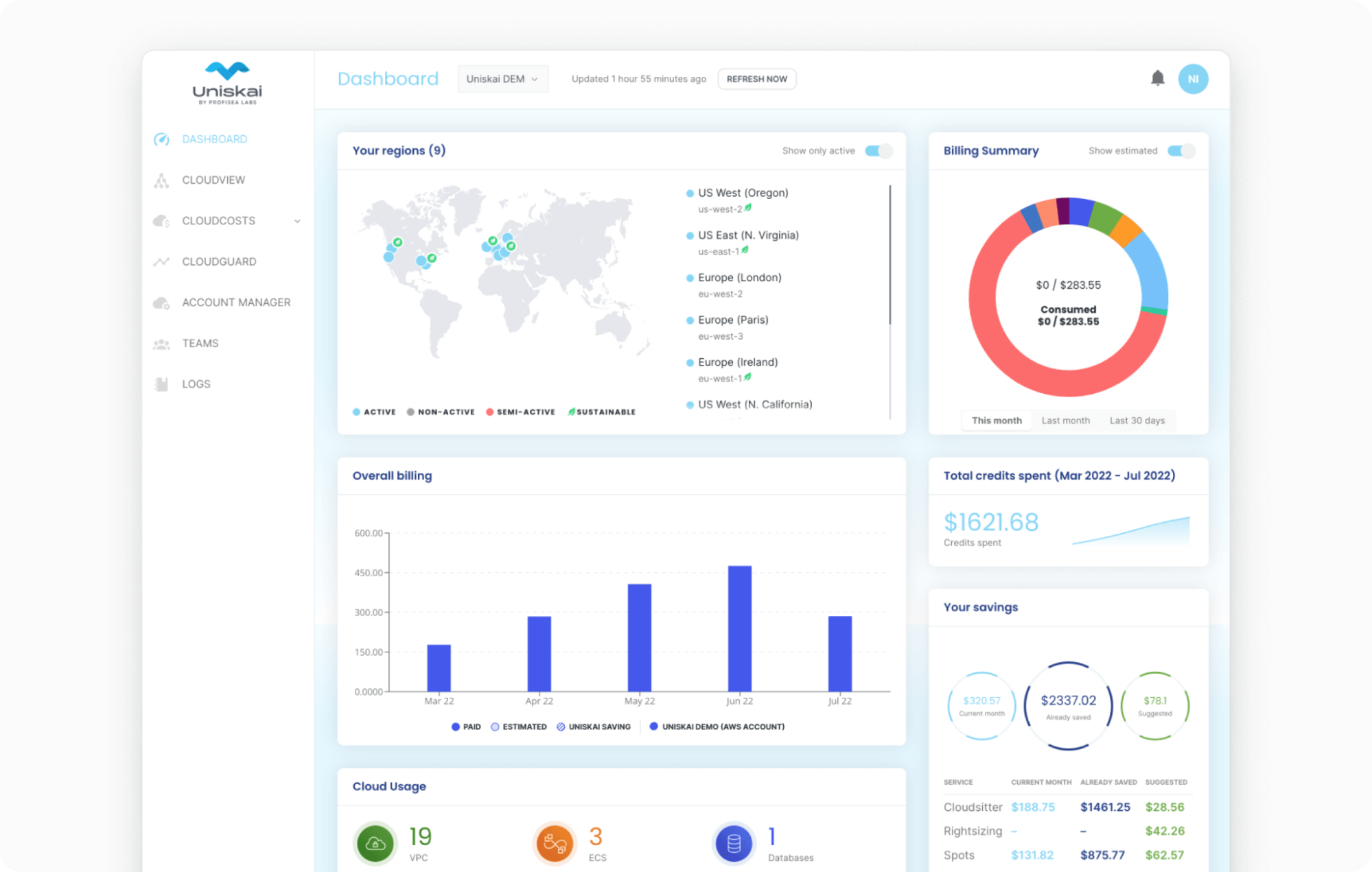
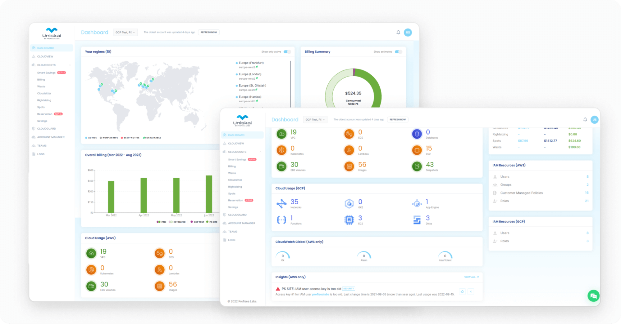
- No single dashboard for all statistical data, so there are many reports from different datasets. It takes a lot of time and energy to find the necessary information and keep track of all the updates. Uniskai’s dashboard allows a complete visual representation of everything inside the cloud. You easily keep up to date with the used resources and all cloud costs. In addition, you can make expense reports, quickly saving data to an Excel file.
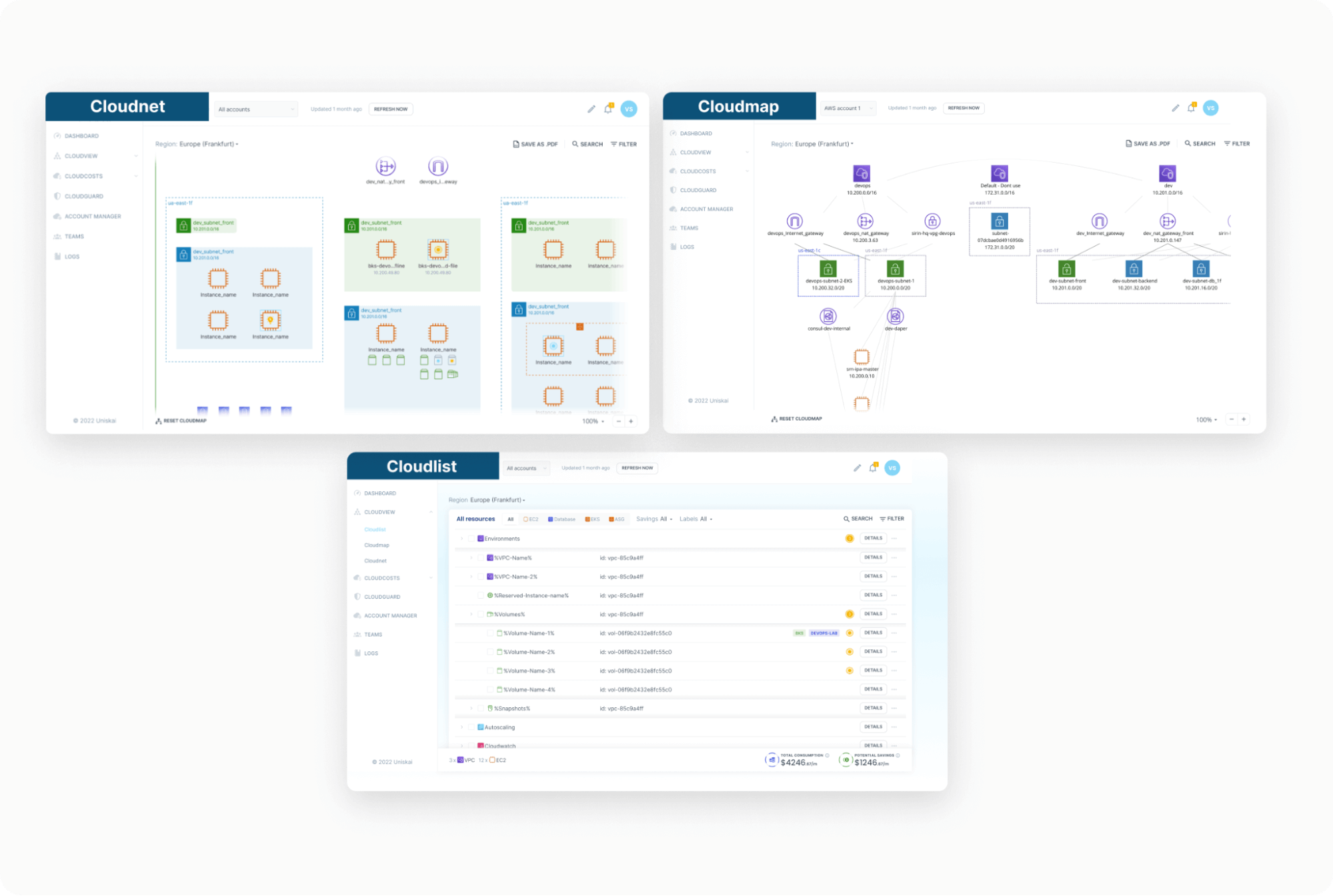
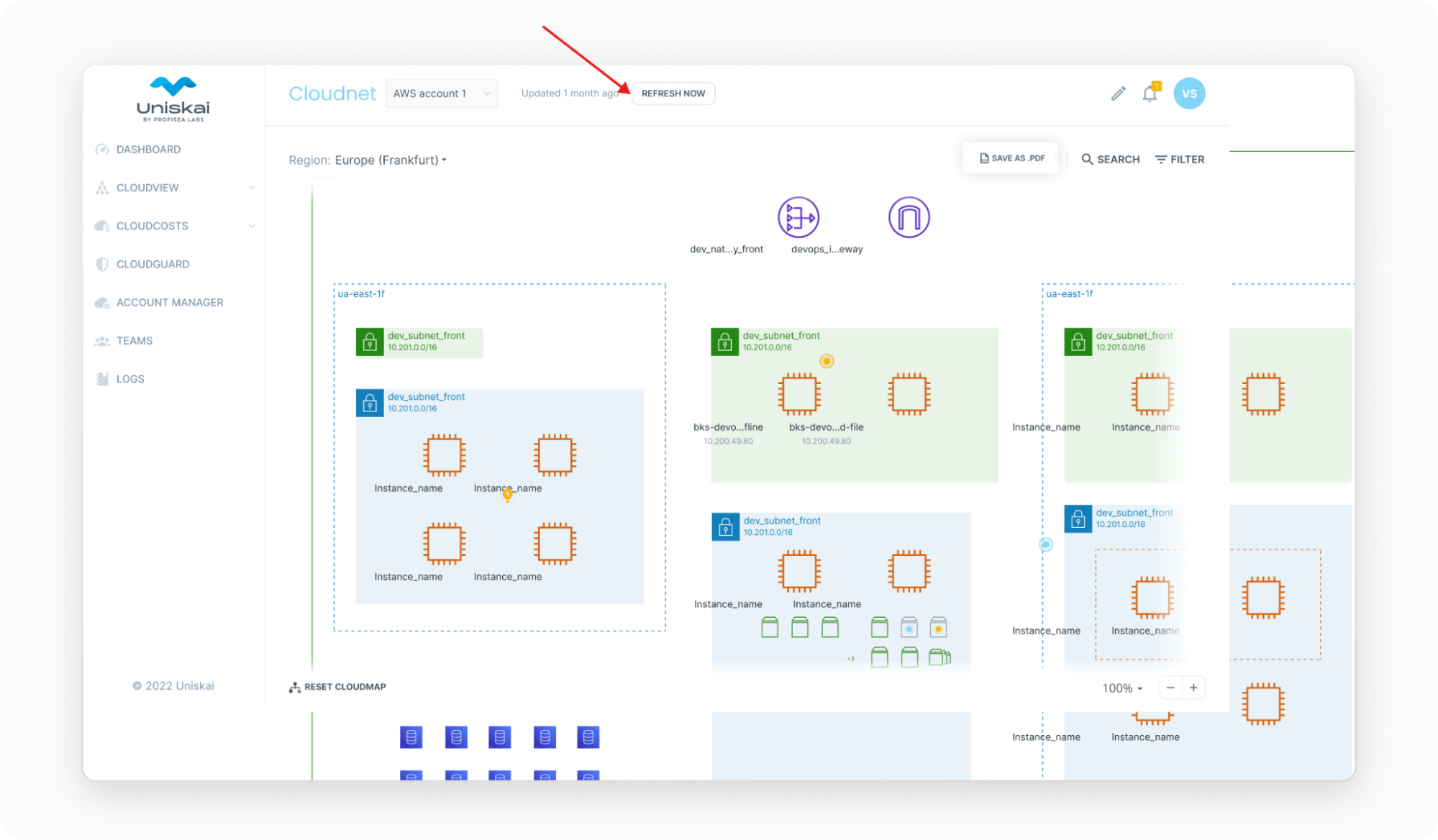
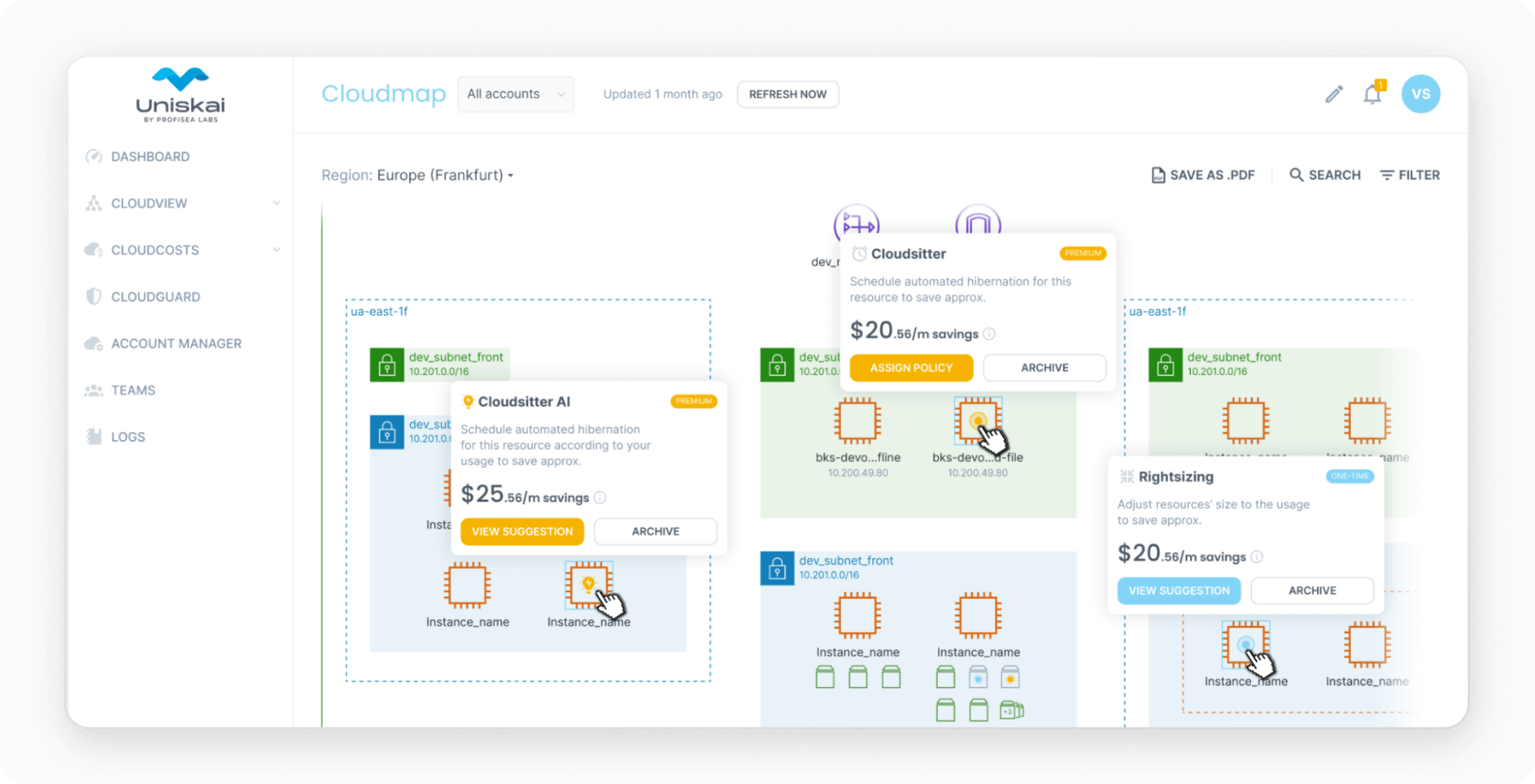
- No complete/visual view of your cloud environment in the form of lists and diagrams so that experts can control all the resources in use. Clicking on Uniskai’s Cloudview gives you a fully-displayed depiction of your cloud-based production environment presented in three forms: Cloudlist, Cloudmap, and Cloudnet. Cloudnet is basically an automatically created architectural diagram of your cloud infrastructure. So experts can control used resources and grasp all the dependencies without drawing actions. Profisea Labs experts also implemented a helpful note feature that allows users to add comments.
- No auto-pull-up data feature for each instance. Instead, Uniskai provides one-click access to all machine details and data management on the charts, including PDF or Excel downloads.
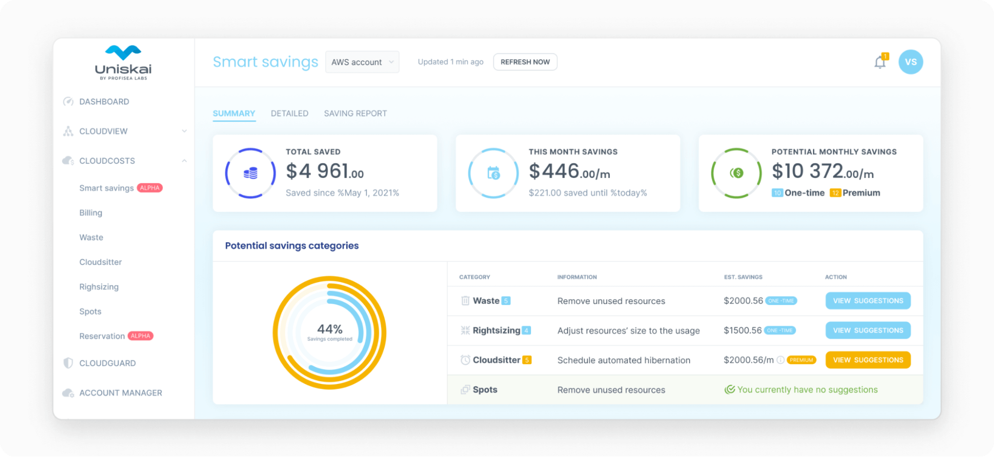
- No immediate optimization suggestions. Uniskai enables viewing cloud diagrams and getting optimization suggestions to deactivate mismanaged instances, rightsize, or convert them to spots.
- No multi-cloud monitoring function. With Uniskai by Profisea Labs, it’s possible to visualize both GCP and AWS accounts to get the whole picture of cloud resources if you opt for a multi-cloud approach.
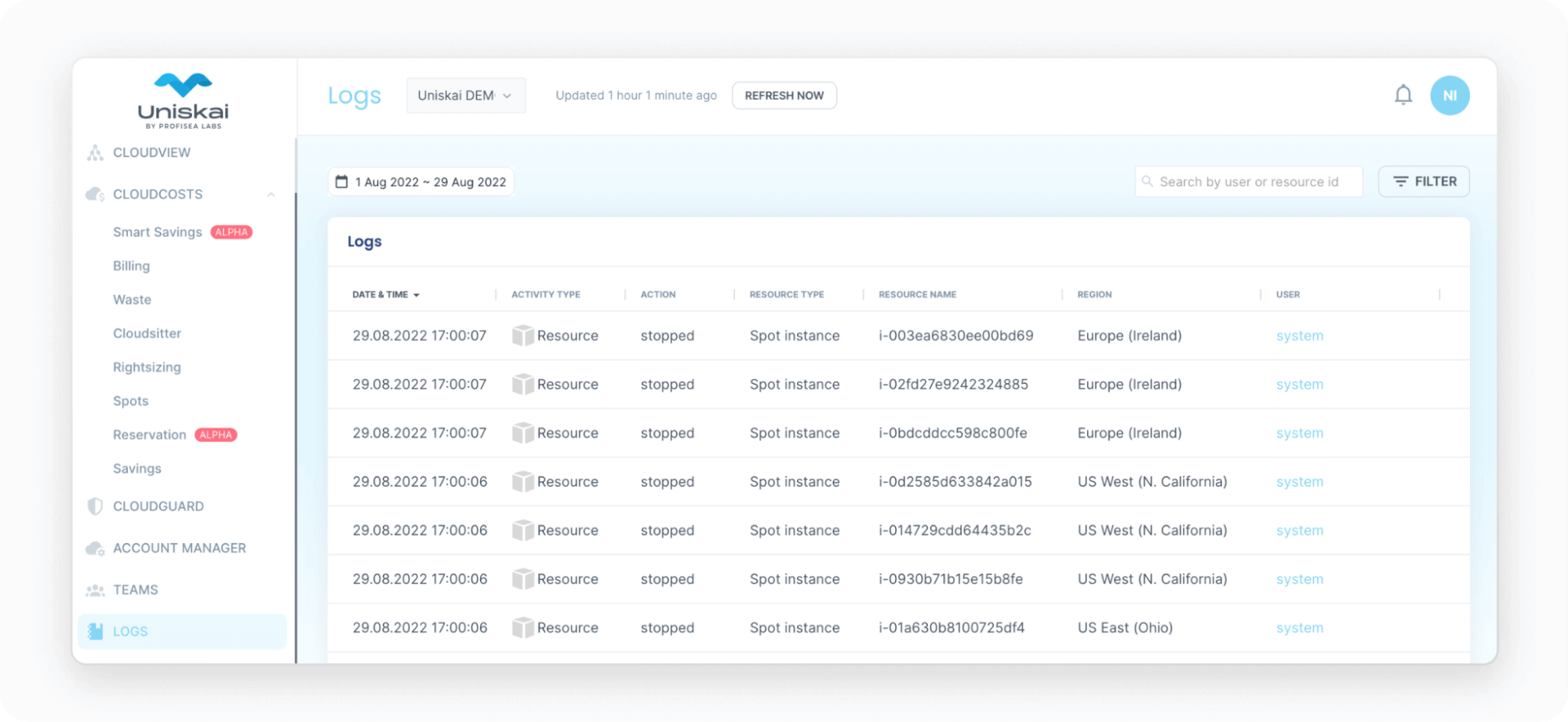
- Lack of functionality to track system changes. Uniskai’s Logs collect all the system updates, including details of who did what and when.
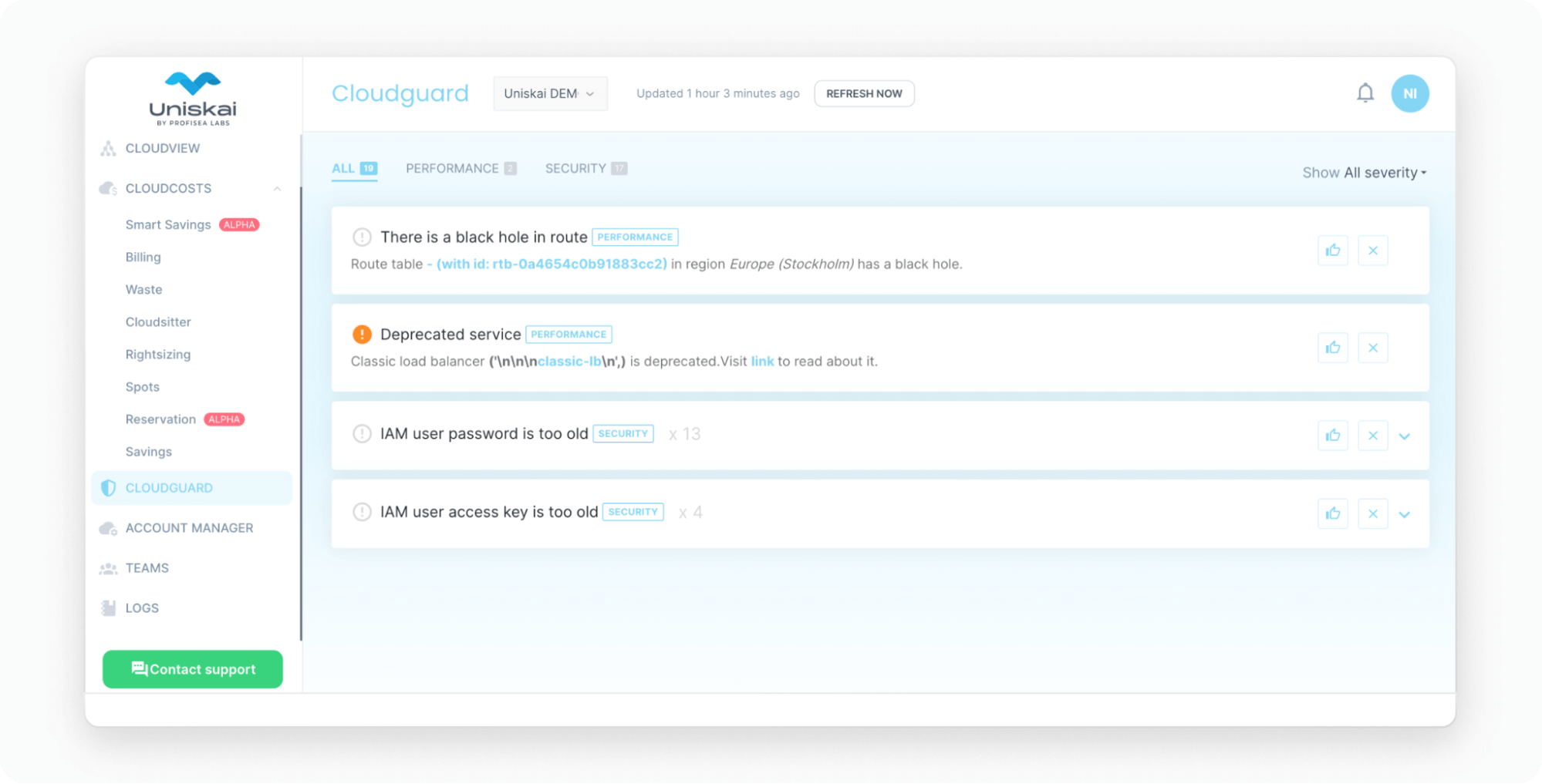
- Lack of cloud security threat tracking with automated advice to forecast and resolve threats. Uniskay’s Cloudguard provides valuable cloud security insights to ensure your data and infrastructure are protected.
- No advice function. Uniskai provides accurate information about your cloud environment and actionable advice on optimizing your cloud infrastructure to save costs.
For eight years, DevOps engineers have used a combination of monitoring solutions such as Grafana and Prometheus for data visualization (Grafana) and storing metrics (Prometheus). And although working with these tools is quite effective, planning, configuring, and maintaining these monitoring pipelines requires considerable time and involvement from DevOps experts. Not to mention the lack of the above functions (all or some) and the ability to immediately correct infrastructure deficiencies based on the conducted analytics right on the spot.
Bottom line
Organizations may underestimate the effort required to set up and manage cloud monitoring when making the move to the cloud. Cloud data is a fairly complex process, even if only one cloud exists. Things become more complex by far in multi-cloud infrastructures, which may well include many departments and individuals. So it is critical to understand what goes on inside the infrastructure to control and manage cloud processes effectively.
Uniskai by Profisea Labs gives you an overview of your entire infrastructure. As a result, you can monitor, troubleshoot, and optimize your resources in multi-account and multi-cloud environments. Uniskai’s insights and AI-powered recommendations help you quickly detect issues before they affect your business. As a result, you can easily optimize usage to save costs, keep within budget limits, detect security vulnerabilities, and quickly generate data reports and architectural diagrams for financial and security compliance auditing.
If you are eager to set up and/or improve your cloud environment visualization and visibility to gain complete control over all your cloud assets, you are invited to contact us.