Why Cloud Visualization Is Not Enough In 2022, And What Is Cloud Visualization With Benefit
One Look Is Worth a Thousand Words
Fred
R. Barnard
Data visualization is the presentation of information in the form of a graph, chart, or other visual formats that makes it easier to see trends and patterns. With Big Data advertising, we need to start interpreting huge amounts of data, and since the goal of data analysis is to gain insights, the data is much more helpful when visualized. Across the tech industry today, we are seeing a visualization resurgence among Cloud Computing and Big Data megatrends. Cloud pioneers like Netflix are open about their struggles with the day-to-day job of setting apart signals from noise in their complex, constantly changing infrastructures, heading us to the only winning option that can solve this issue – to use cloud visualization.
Well, it’s hard to argue the fact that AWS is a market leader because Amazon Web Services is the first item in the list of cloud computing industry’s top players, says Gartner’s Magic Quadrant for Cloud Infrastructure and Platform Services. What makes AWS so special? Lots of benefits, but yet the most noticeable is the vast number of services (more than 200) AWS offers. It means that everyone using the AWS Cloud has to use the AWS Console. Now, can you just imagine lifting the lid of this console to expose dozens or even hundreds of the configured systems running underneath? Trying to single out critical insights from this noisy performance is very difficult for both novice and experienced users. Getting an in-house tech team to draw conclusions about what's going on from the AWS console is time-consuming and error-prone. With the rise of new-gen imaging technologies, the good news is that you don't need to be a cloud expert to reap revolutionary benefits from using innovative cloud visualization platforms, and you can start today.
What is data visualization, and why do we desperately need it?
The idea of using images to quickly grasp information has been around for centuries, at the same time, it was hi-tech evolution that greatly highlighted data visualization. Artificial brains have facilitated people to absorb tons of materials at lightning speed literally forcing visualization of these data amounts to develop.
“Data visualization is the art of depicting data in a fun and creative way, beyond the possibilities of Excel tables. In a way, it’s like setting figures to music,” says Charles Miglietti, co-founder of Toucan Toco.
Data visualization points out the transformation of shapes and uncooked data into visual objects: combining convenient and artistically pleasing features greatly speeds up data exploration and analysis. Humans are built the way they can deal with information in the form of drawings to picture large amounts of complex data easier than scrolling textual sheets. Data visualization is a fast and simple way to communicate ideas universally. Data visualization can:
- Detect attention-craving areas
- Formulate the factors that determine customer habits
- Help catch what products/services to focus on
- Anticipate business capacity.
Main Cloud visualization solutions to date
Here is a list of the most popular cloud visualization products:
- Xplenty is a cloud-based data platform that provides data of your infrastructure integrating insights from more than one hundred SaaS apps. Xplenty provides rich expression language, advanced API, and can be easily customized, providing support through email, chats, phone, and online meeting apps. Unfortunately, Xplenty offers only an annual billing option, which is quite seldom, especially in terms of rapidly changing cloud billing scenarios.
Amazon QuickSight allows you to easily design and put out conjoint business intelligence dashboards and receive replies immediately through local language interrogations. QuickSight dashboards are highly accessible and integrated from/into any gadget or website. Given the solution’s capability of automatic scalability, you don't need any extra operation infrastructure or planning tools.
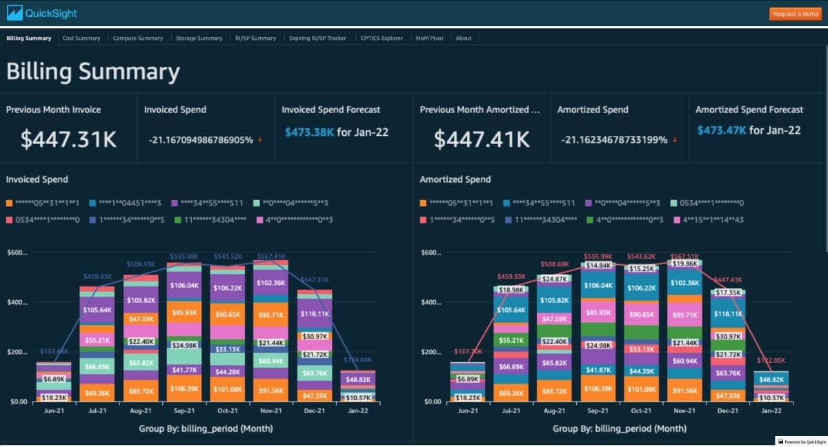
Source: amazon.com.quicksight.gallery
- SAP Analytics Cloud helps users process big data volumes and generate visualization items to foretell business outcomes. SAP also gives access to state-of-art modeling solutions to alert users about potential data flaws, categorize data dimensions, and measure data bulks. SAP Analytics Cloud also offers intelligent data facelifting to upgrade visualization.
- Azure Data Explorer is a fast and highly scalable data mining service used to create sophisticated data processing solutions. Azure Data Explorer is highly integrative as well capable of teaming up with visualization tools.
Data Studio from Google can help you understand your data and aid in interactive analysis. Data Studio helps you keep your field trends under the radar, respond quickly, and turn to data foretelling. BigQuery is a paid product and you pay for it when you access BigQuery via Google Data Studio.
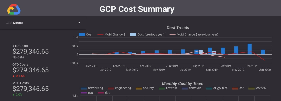
Source: cloud.google.com
What is the problem with existing cloud visualization tools and what solution do we propose?
In reality, notwithstanding the provident cloud providers catered visualization tools for their users, most of them, if not all, have several significant drawbacks:
- No real-time insights. Most reports are updated every 24 hours or even less frequently, provoking notable starvation for understanding the real-time picture.
- Too complex for non-experts. In most cases, organizations need to turn to cloud experts to configure, automate the visualization dashboards, and more importantly, translate the insights from expert to human.
- No one dashboard for all insights, consequently, too many reports from different data sets, which makes it quite a time & energy-consuming matter to find the necessary information and keep track of all the updates.
- No multifunctional sharing/reporting to other environments. Business users mostly waste time translating developing reports, and they lack versions where they can promote the report from one environment to another for quick and precise interpretation. Plus, sharing reports with the user who is not added in IAM is too complex.
- No immediate GUI management. Just imagine how cool it’d be if you could not only have your cloud infrastructure diagram to look at your infrastructure but also manage it right inside these graphs: deactivate mismanaged instances, rightsize, or convert into spots them. This advanced feature is a very seldom advantage amid existing cloud visualization tools.
- No advice function. Sophisticated cloud visualization tools not only deliver precise insights about your cloud-based production environment but also give actual advice on how to optimize your cloud infrastructure, upgrade it, save money, and time.
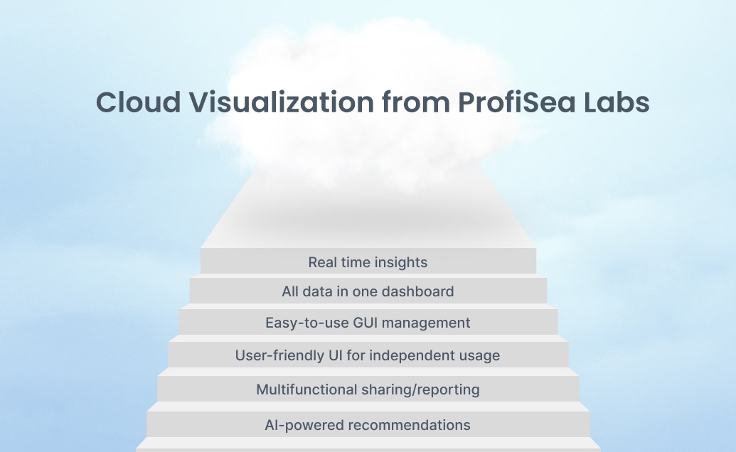
As we see it, the best visualization option available today is ProfiSea Labs that provides real-time, interactive, data-rich relationship graph models of AWS, Azure, and GCP-based infrastructures together – in one dashboard. ProfiSea Labs is a new-generation, innovative multi-cloud management platform that allows you to visualize, operate, analyze, scale up/out, monitor, and optimize your cloud infrastructure. With ProfiSea Labs, you get:
- Clear visualization via automatically generated cloud architecture diagrams, maps, and graphs
- Real-time insights about your cloud-based environment
- Easy-to-use GUI management to operate infrastructure right inside the diagrams
- 24/7 control over cloud computing spendings
- Costs optimization recommendations based on AI/ML-powered strategy
- Reduction of spendings up to 90%
- User-friendly UI for cloud-non-experts independent interpretation and management
- Time-saving
- Explicit analytics and reporting from one environment to another for quick and precise interpretation
- Streamlined DevOps/CloudOps processes
- Boosted teams productivity
- Increased ROI.
Now, that’s what we call cloud visualization with benefits! ProfiSea Labs doesn’t seek to replace existing solutions for cloud visualization; its role is to present a more sophisticated platform to make it easier for everyone to understand and assess the current state of resources and cloud components relationships.
Bottom line: ProfiSea Labs is all you need to get cloud visualization with benefits
ProfiSea Labs is a user-friendly yet reliable solution that provides a first-class virtual view of all your assets and accounts in any location within seconds. ProfiSea Labs empowers you to take full advantage of cloud investments and guarantees that managing cloud environments has never been easier before. So, don't waste your time, contact us, try ProfiSea Labs for free and see how you can improve your end-to-end production cycle on the cloud. Plus, we can consult you on any Cloud/DevOps/SRE-linked issue you have.